Product Label Trends Which Will Differentiate Your Brand
"Don’t judge a book by its cover”, is a quote that could not stray further from the truth when it comes to the final purchase decision of your customers.The better your logo, labelling and packaging is, the higher the chance to attract more customers. Of course, the star of the show are the unique attributes of the product itself. What will make or break your product though is how you can communicate these features. What better way to convince your customers that the outside of your product also matches the inside, than with packaging and labelling design?
At MIRON Violetglass we realize the importance labelling has to make your luxurious products stand out in the product landscape. Let’s have a look together at 3 selected labelling trends your business could benefit from.
The Narrative Label - Tell Your Story
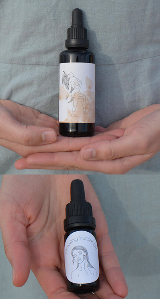
Stories are everywhere. Our daily lives are devoted to telling stories about what has been, what is and what will or could be. We’re all drawn to them which is why storytelling can be a powerful tool in relation to labelling. The best way to connect with your customers via a story, is to resonate with them on a personal level. If you communicate the unique selling points of your products as dry facts, your audience won’t gain a lasting impression of your brand. They might not even remember anything you expressed. We’re certain that your company has a story or many stories to tell and there are many ways to voice them.
Apart from words, you can also make use of photography, illustrations, bold colors and shapes to communicate a compelling narrative. After all, it is a well-known fact that a picture is worth a thousand words. You might have a great founding story of your reason to be. Maybe the whole idea for your product came to life on a stormy night on a boat at the sea. Don’t limit yourself by only communicating this on your Website, when you can show and visualize it with your labelling.
Your product labelling could bring the characters of your brand’s story to life. Today we can observe many businesses who make use of bold colorful graphics or illustrations as narratives. Some also opt for actual written text which can be a continuous story between multiple products. The possibilities seem endless and by following this trend, there are no limits to creativity. Gain the rewards of customers who have emotionally interlinked to your brand and reason to be. A relationship that is always worth investing in!
Timeless Aesthetics
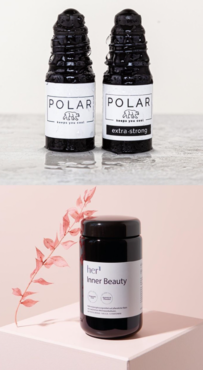
Due to the winds of change in 2021, customers look for high-end experiences and beauty in the face of current uncertainty. Your brand can therefore never go wrong by opting for a classic black design and attention grabbing bold white letters. A direct printing impact can be achieved with so called white ink printing on bottles or jars. The labelling and packaging itself emerge into one entity with this trend. At first glance, this trend might seem too ‘quiet’ in the landscape of product choices. This is however far from the truth, as once again, there are no limits to creativity. Add intricate details or patterned graphics to provide your customers with a sneak peak at what you stand for.
We believe that a timeless black design in combination with bold letters and clear, uncluttered layouts which simply make sense will appeal to multiple market segments. From cosmetics & skincare, to foods-drinks & apothecary as well as natural healing and well-being, your brand will (loudly) make itself known.

White Space and Typographic Paring
Based on the philosophy that less is more, minimalism has been an ongoing trend in multiple design sectors. From UX design to the fashion industry as well as packaging and labelling. Although many businesses included approaches such as colorful schemes, patterns and storytelling, your brand can opt to stand out and claim redefined minimalism for maximum impact. The trend white space in combination with typographic paring is all about drawing the attention of customers to particular elements of the label. A white space doesn’t need to be white. It is the portion of the label, which is left untouched, the empty space between the elements. A white space can be any color, pattern or even illustration which communicates your house style and brand message.
You’ll notice that the key to aesthetic composition is expressed via the balance between those elements. The right choice of varying sizes and matching typography will ultimately create continuity between the information you want to give to your customers. It also improves its legibility. By using white space, your label will successfully communicate elegance, openness and freshness. Give your customers a second to catch their breath.
No matter what trend your brand follows or not follows, concluding it can be said that the packaging and labelling will always be the first impression of your product. Think about how labelling can help you to communicate your message, your values and your beliefs. MIRON Violetglass hereby strives to assist you on this journey. To make your luxurious product stand out.
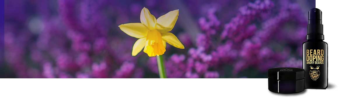
Are you in need of some inspiration? Check out the Instagram pages of her1, Angry Beards or Cosmydor who combined our beautiful MIRON jars and bottles with the latest labelling trends. Follow our own Instagram or Pinterest channel where we showcase your unique products and to always be up-to-date about our latest achievements.